
Cognitive Systems Corp - Website Redesign
Cognitive Systems Corporation (CSC) relied on an external agency for website updates, leading to slow turnaround times, high costs, and limited flexibility. The existing site had broken navigation, accessibility issues, and inconsistent responsiveness, making content difficult to find. With a company-wide rebrand underway, CSC needed a scalable, user-friendly website that aligned with its new identity.
Role
UX Designer
Team
Marketing, UI, Development
Timeline
August 2023 - January 2023
Tools
Figma, Zoom, Slack, FigJam, Trello, Confluence, Jira
Problem
A Website That Limited Growth
CSC’s marketing website was managed by an external agency, causing slow updates, high costs, and limited flexibility. Users struggled with broken navigation, accessibility gaps, and inconsistent responsiveness, making it difficult to find content. Additionally, a company-wide rebrand meant the website no longer aligned with CSC’s new identity and business goals.
Solution
Redesigning for Growth, Accessibility, and Brand Alignment
To solve these challenges, CSC transitioned website ownership in-house, enabling faster updates and long-term scalability. As the UX Designer, I led the redesign, improving navigation for seamless content discovery, enhancing accessibility to meet WCAG standards, and ensuring a responsive design across desktop, tablet, and mobile. The new platform reinforced CSC’s brand identity, strengthening its position as a leader in WiFi sensing technology.
🚀 The new website is now live, providing clear navigation, professional design, and a focus on the value proposition of WiFi sensing technology.
Research
Information Architecture
I used insights from a card sorting exercise to create an information architecture that organizes content intuitively. This ensures users can easily navigate the website and quickly find relevant information.
With a clear structure in place, I moved into wireframing to define navigation flows and layout options, ensuring a seamless user experience.
Develop
Low-Fidelity wireframe
I created low-fidelity wireframes to test layouts and navigation with the Marketing team before moving into high-fidelity designs. These wireframes helped validate content hierarchy and ensure users could efficiently find information.
Early testing allowed for quick iterations, ensuring a clear and intuitive structure before refining user interactions. With a validated structure in place, I developed wireflows to define user journeys and navigation paths.
Wireflow
Building on the wireframes, I designed wireflows to map out user journeys and refine interactions. This ensured seamless navigation and a logical content flow across pages.
Wireflows provided a blueprint for user interactions and transitions, ensuring smooth navigation across the website. With a clear interaction flow established, I transitioned to developing a design system to maintain consistency in high-fidelity designs.
Design System
After finalizing wireframes and wireflows, I created a design system to maintain consistency and efficiency across the website. This system included responsive grids, standardized buttons, typography, text fields, and structured containers, ensuring a unified and scalable design approach.
The design system translated CSC’s new brand identity into a structured, reusable framework. By standardizing UI components, it streamlined development and ensured long-term scalability.
Implementation & Testing
Once the developers built the website, I tested it across various devices, including desktop, tablet, and mobile, to ensure it met design specifications and functioned correctly. I compared the live pages to the design mockups and documented any discrepancies in Jira for resolution.
UX Improvements
I redesigned key aspects of the website to improve usability, accessibility, and responsiveness. Here are some examples of UX improvements that enhance navigation, accessibility, and responsiveness.
Navigation & Content Discoverability
I streamlined the website’s navigation by updating menu items and removing unnecessary submenus to improve usability and reduce clicks.
• Replaced ‘Technology’ with ‘WiFi Motion’ to directly guide users to product details.
• Moved ‘Career’ and ‘Contact’ to the primary navigation bar for easier access and improved user experience.
• The ‘Technology’ category was unclear, making it harder for users to find product-related information.
• ‘Career’ and ‘Contact’ were hidden in submenus under ‘Company’, reducing visibility.
Accessibility Enhancements
To enhance accessibility, I addressed color contrast issues in the UI to improve text visibility and readability.
• Updated button colors to align with the brand palette while ensuring sufficient contrast.
• Improved readability and created a more inclusive user experience.
• White text on yellow buttons created low contrast, making it difficult to read.
• Users with visual impairments or in low-light settings struggled with visibility.
Button Accessibility Improvements
To improve usability on mobile devices, I increased button sizes and adjusted spacing to ensure buttons are easily tappable and accessible across all screen sizes.
• Buttons were too small on mobile devices, making them difficult to tap.
• Increased button size to improve touch accessibility.
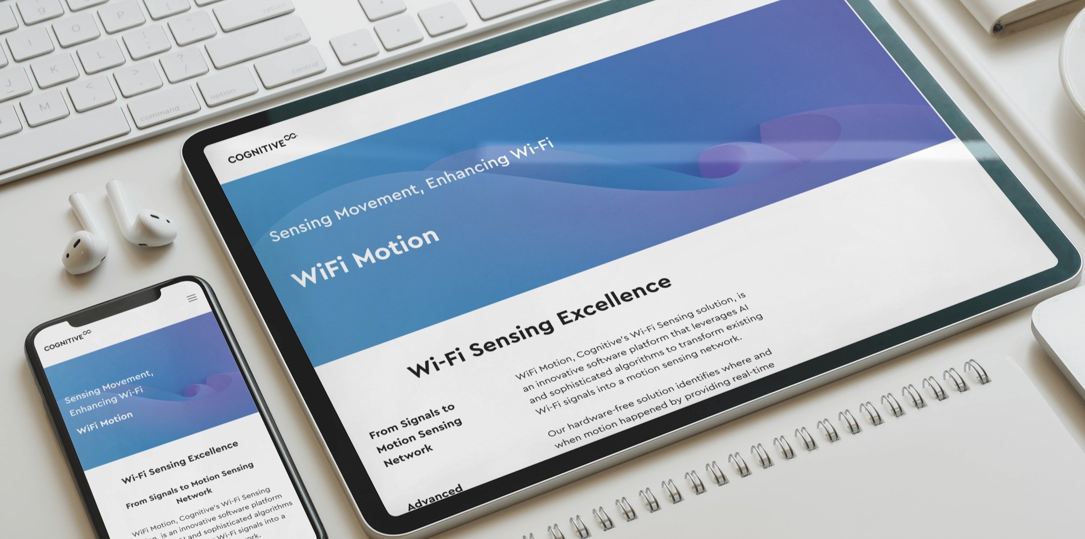
Responsive Design Across Devices
To ensure a consistent user experience across all screen sizes, I implemented a responsive layout that dynamically adapts to desktops, tablets, and mobile devices. This guarantees that the design remains functional, visually clear, and user-friendly, regardless of the device being used.
Below are mockups showcasing the website's responsiveness across desktop, tablet, and mobile screens.
What I Learned
Aligning the UI team on responsive design principles was a key challenge, leading to inconsistencies in font usage and scaling issues. I resolved this by adjusting typography, clarifying requirements, and collaborating closely through multiple iterations. This experience reinforced the importance of clear communication, documentation, and proactive problem-solving in cross-functional design work.
Next Steps
While the redesigned website has improved navigation, accessibility, and responsiveness, there are still opportunities for further enhancements.
User Research & Feedback: Implement ongoing user testing and analytics tracking to identify pain points and optimize the experience.
Accessibility Enhancements: Conduct regular accessibility audits to ensure compliance with WCAG guidelines and improve usability for all users.

