Cafe To
Helping users with dietary needs easily find, personalize, and pick up healthy meals
2021
Cafe TO is a conceptual project based on a Toronto-based café offering healthy meals for individuals with dietary restrictions. Many existing food ordering platforms lack ingredient transparency, customization options, and flexible pickup features, which leads to frustration and limited choices for users with specific dietary needs.
As the solo designer, I created a responsive web app that allows users to filter meals by dietary preferences, customize ingredients, and choose convenient pickup times. This resulted in a more inclusive and user-friendly ordering experience that gives users greater control and confidence.
Instantly find meals that fit

Filters like gluten-free or dairy-free help users quickly narrow the menu, making it easier to skip irrelevant items.
Customize meals with ease

Ingredients can be swapped or removed with a tap, giving users full control to adjust dishes based on their preferences or restrictions.
Choose pickup times that work
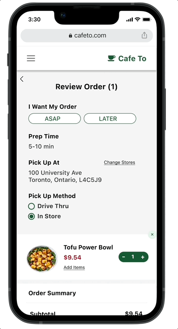
Whether it’s ASAP or later, users can schedule pickups around their routine for maximum flexibility.

💡 What I Learned from Users
Surveys and interviews revealed five recurring pain points:
60% struggled to find food that matched their dietary needs
90% said they were too busy to cook regularly
Preference for speed: users preferred guest checkout and fast ordering
Lack of transparency: users wanted clearer ingredient info
🔁 Iterating Based on User Feedback
After usability testing, I made two key updates that directly addressed user frustrations around personalization and time flexibility.
👇 Iteration 1: Customization made simple
I added a “Customize” button to each menu item page, allowing users to easily swap or remove ingredients to match their dietary needs — making selection faster, clearer, and more personal.
👇 Iteration 2: Pickup on your schedule
I introduced “ASAP” and “LATER” options at checkout, giving users the flexibility to choose a pickup time that works best for them — helping busy customers feel more in control and less rushed.

Final Design
Responsive Design for Every Screen
To ensure a seamless experience across devices, I optimized the layout for mobile, tablet, and desktop. This allowed users to browse and order meals with ease, no matter where or how they accessed the site.
So what changed?
Users can now instantly filter meals by dietary preference, saving time and removing guesswork
A simple customization flow lets users swap ingredients in one tap, giving full control over their meals
Flexible pickup options (ASAP or Later) fit busy schedules and make healthy eating more convenient
Responsive design ensures a seamless experience across devices including mobile, tablet, and desktop

New feature, new lessons
Through testing, I learned that validating assumptions early is essential—not only to avoid misaligned solutions, but to uncover real user needs that might otherwise go unnoticed. Taking time to test early helped me prioritize what mattered most, save effort in later stages, and ultimately design a more focused and impactful experience